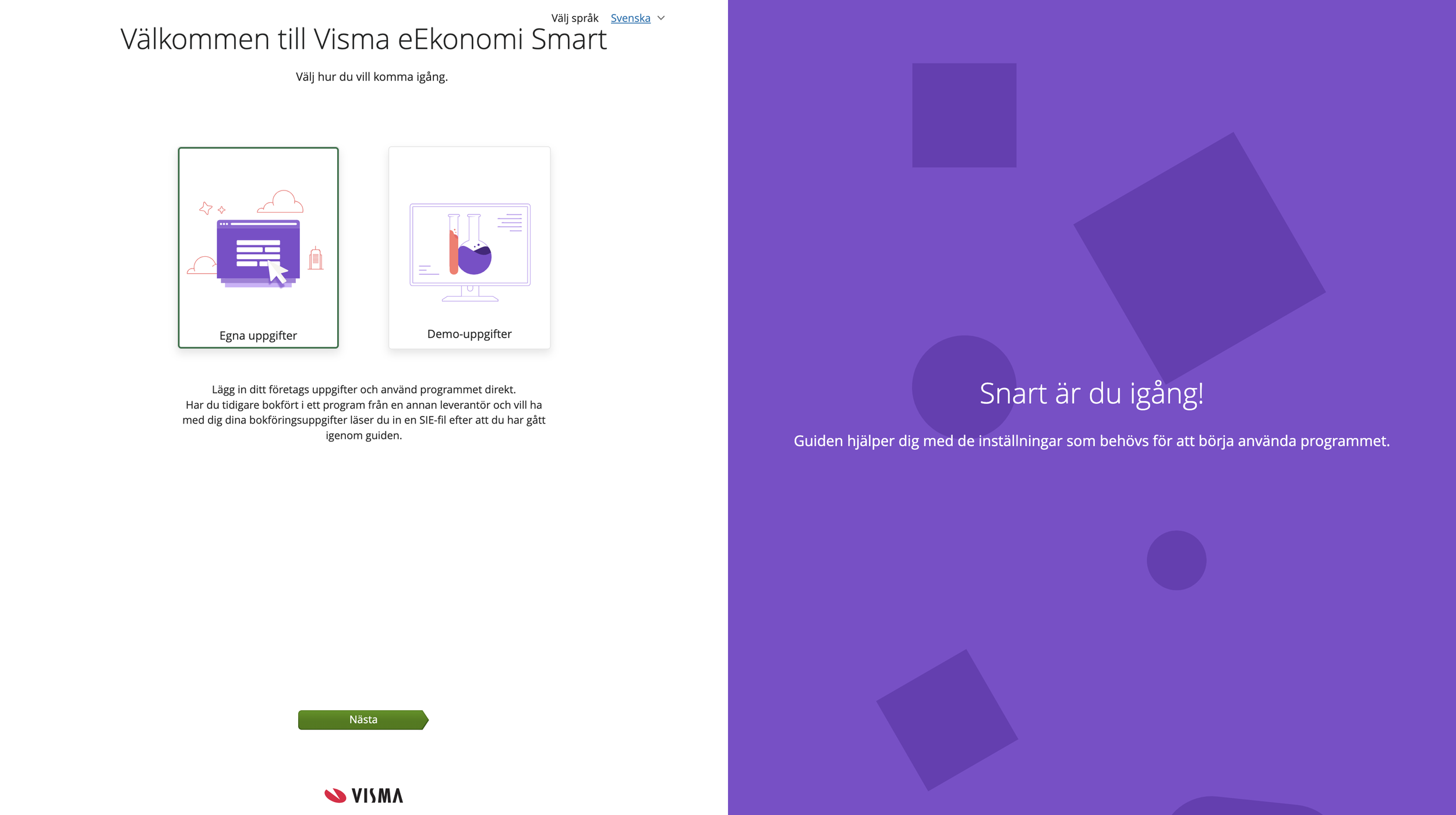
Onboarding for Visma eAccounting
Aimed to decrease churn and enhancing the clarity of onboarding by simplifying information.
TL;DR
Redesigned the onboarding, making it slimmer and easier to understand. UX/UI Design. Interaction Design. Information Architecture. Conversion
disclaimer: my design was implemented before the rebranded purple colour so images were updated in October 2023 to reflect the rebranding but the rest remains the same.
Employer
Visma
Year
2018
It all started when….
My team and I which consisted of two developers, product owners and I optimized the onboarding process for Visma eAccounting. This resulted in a streamlined and user-centric experience. By revamping the onboarding flow, we aimed to simplify the often complex setup process and provide users with a clearer understanding of why specific information and actions were required.
Before this, I gathered insights from older tickets opened by customers where they had asked our customer support team questions about certain things in the old onboarding that weren’t clear to them. All the questions made it take longer for them to finish the onboarding or sometimes even drop off.
We generated multiple design concepts for the onboarding flow, eventually narrowing it down to two distinct approaches. To determine the most effective solution, we conducted A/B testing using Google Optimize and engaged our existing customer base particularly those who had expressed interest in testing new features, via UsabilityHub.
Our testing criteria extended beyond mere comprehension; we delved into the emotional aspect of user experience. It wasn’t just about the numbers, we aimed to understand how users felt about the process. The results were enlightening. A significant portion of participants found the current design to be visually engaging and even described it as “more fun” compared to the previous, somewhat drab rendition. This insight shed light on the significance of not just functionality but also the emotional resonance of the design, ultimately contributing to a more engaging and user-friendly onboarding experience.
The process
The impact
I am not able to disclose the name of the tool but it uses tens of thousands of hours of research to measure several data points, which later on can be used to cross-check a websites user experience - in this case, Elon.se.Other than this we also incorporated feedback received from Trustpilot to emphasize certain areas.
The first section I looked into was the checkout process which ranked fairly good on a rank from poor -> mediocre -> decent -> good -> perfect. A lot of the heavy lifting was done by third-party integrations such as Klarna (payment) and Ingrid (shipping).
Thereafter I went on to analyse the search functionality which landed between poor-mediocre mainly because of the results logic, which indicated that there was room for improvement in what would be shown as a result after a search. When testing this, we try different ways of searching: synonyms, common abbreviations, and symbols among other things.
In parallel to this, my colleague looked into their product listing and product pages. And, as mentioned we also considered reviews on Trustpilot.
After looking into these areas and compiling our findings, a deck of our insights were created to present to the team at Elon.se

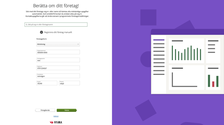
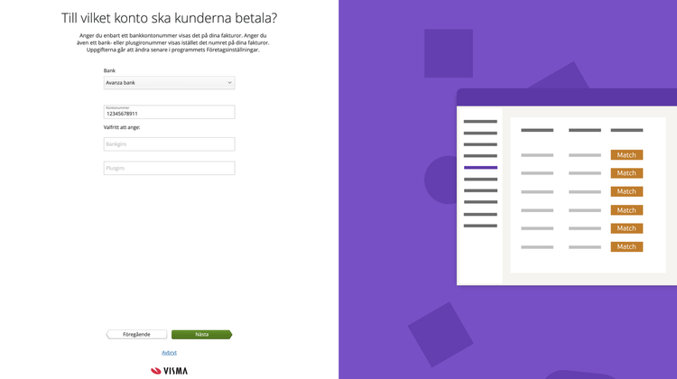
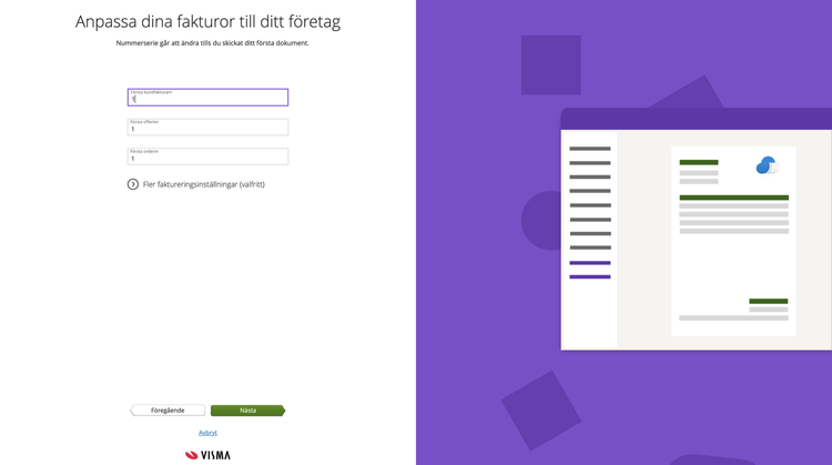
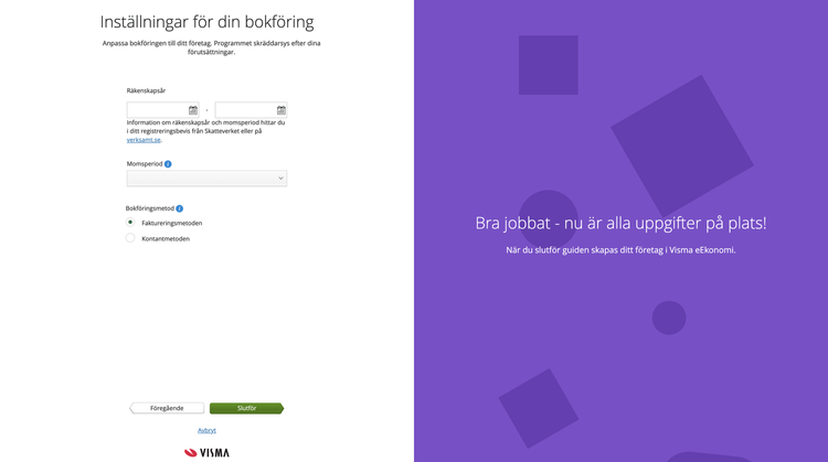
This project’s core objectives were to reduce churn rates, boost user engagement, and ensure that users felt empowered an informed from the very beginning. The redesigned onboarding flow not only made eAccounting more accessible to users but also contributed to higher retention rates.
The same onboarding is still used 6 years after implementation and after I left the company.
