Potential improvements for an ecommerce
An audit of Elon.se to identify improvement areas
TL;DR
Identified improvement areas in terms of the search logic, product- listings and pages.
Client
Elon.se
Year
2022
It all started when….
Two colleagues of mine at tretton37 and I decided to create an audit for Elon.se to see what would be able to be improved. I as a designer, another designer colleague and a business developer worked for a little less than two weeks. Our goals for this initiative were to evaluate the Elon.se user experience based on established industry standards and best practices for e-commerce and identify what the biggest issues are for customers using the website. The core areas we decided to focus on in the website were search functionality, product listing & filtering, product pages and checkout. The reason behind these areas was an assumption on our side thinking that they would benefit the most from our audit.
The process
The result
I am not able to disclose the name of the tool but it uses tens of thousands of hours of research to measure several data points, which later on can be used to cross-check a websites user experience - in this case, Elon.se.Other than this we also incorporated feedback received from Trustpilot to emphasize certain areas.
The first section I looked into was the checkout process which ranked fairly good on a rank from poor -> mediocre -> decent -> good -> perfect. A lot of the heavy lifting was done by third-party integrations such as Klarna (payment) and Ingrid (shipping).
Thereafter I went on to analyse the search functionality which landed between poor-mediocre mainly because of the results logic, which indicated that there was room for improvement in what would be shown as a result after a search. When testing this, we try different ways of searching: synonyms, common abbreviations, and symbols among other things.
In parallel to this, my colleague looked into their product listing and product pages. And, as mentioned we also considered reviews on Trustpilot.
After looking into these areas and compiling our findings, a deck of our insights were created to present to the team at Elon.se
Impact and reflections
Collection of some reviews
The assessment for the checkout process. Also comparing with some competitors.
We found areas that could be improved in the areas that we looked into. The part that had the best user experience according to the tool we used was the checkout section where Klarna and Ingrid did a lot of the heavy lifting which resulted in a very clear way of letting the user go to check out without having to make an account (proceed with guest account), choose store pickup or shipping with an uncomplicated validation inputting information in the necessary forms.
The less good parts of our findings were the results logic when investigating the search functionality, the product listings and the pages. I will summarize each one of them below.
The less good parts of our findings were the results logic when investigating the search functionality, the product listings and pages. I will summarize each one of them below.
Search
If they can’t find it, they can’t buy it.
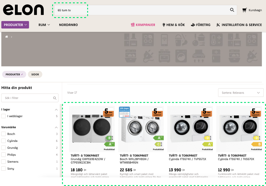
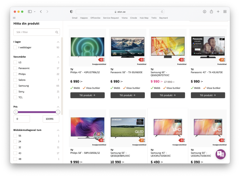
When choosing a category prior to making a search, users assume that a search will be within the scope of the category one just picked but this isn’t the case. Additionally, when a search has been made there are filters to the site that can narrow a search even further but most of the time these filters weren’t relevant to what just had been searched. E.g. being able to filter on volume (litres) when the search query is “tv”.
Abbreviations and symbols didn’t have any support which might not sound like a huge issue but 36% of sites don’t support those types of searches which results in users completely missing out on most of the entire relevant products if they are searching using inch when the site has used “ or in, for example.
Product lists and product page
The people behind the tool we used have done research that showed that sites with a mediocre rate on this topic see dropoffs of 67-90% depending on how severe the issue is across all product listings.
Elon.se only uses a grid layout which often does the job. However, the product catalogue of Elon.se is very spec-driven. Meaning the products have key features that you as a seller probably want to highlight in order to help the user find the right product for their needs. Spec-driven products usually need more space to display this information, which is why a list layout performs better than a grid layout.
Cross-selling on e-commerce pages is a huge thing and when done right, even the users love it because it leads them to better-suited products or just informs them about something else they might need in addition to what they first were looking at.
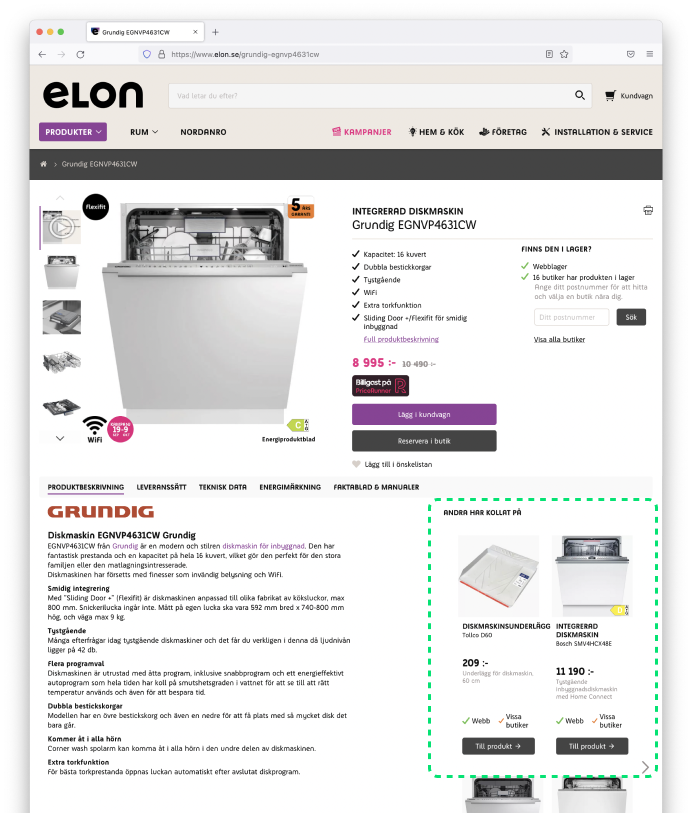
On the Elon.se product page, users get recommended just a couple of items but what if these items don’t fill the need (feature-wise) of what the users want? Then they might instead want to go into the category itself and browse. But if there are no links to this category from the product page they are at, then they have to manually go back to previous pages or make a new search. This requires a lot more time and effort and may even prevent them from finding the product that matches their needs.
Suggested items are great but allow users to also go into the categories to prevent them to manually go back to previous pages or make a new search.
Other than the cross-selling, we also saw potential improvement in the review section. In general, a huge percentage of people buy a certain product by seeing what people have said about the product. On Elon.se the amount of reviews is lacking but this goes hand in hand with the process of actually being able to put reviews.
Why are there so few? Perhaps Elon.se has to allow users to submit a review without an account and streamline the review form. Obviously, allowing just anyone to make a review comes with consequences as well but the “how” in this would be something that has to be investigated further.
Our findings were compiled into a presentation deck which was shared with the team Elon.se This goes to show what can be done just during a quick burst of the research phase.
This is just one of many approaches designers can take when trying to find improvement areas for a website.
This approach could be scaled to an even bigger initiative. It could be developed into auditing even more spaces on the website. We could come up with solutions to each problem that every section of the website. We could find site visitors to interview. We could prototype a solution to every issue that we see. We could analyze and impact any changes even further. How does all of this impact the sales altogether? How does it affect the users' feelings towards the website? Do they find the site annoying to even browse or do they love it, and why?
There are a lot of things that I and the lovely people at tretton37 could do.


